An overview of material icons—where to get them and how to integrate them with your projects.
What are material icons
Material design system icons are simple, modern, friendly, and sometimes quirky. Each icon is created using our design guidelines to depict in simple and minimal forms the universal concepts used commonly throughout a UI. Ensuring readability and clarity at both large and small sizes, these icons have been optimized for beautiful display on all common platforms and display resolutions.
See the full set of material design icons at the material icons library.
Getting icons
The icons are available in several formats and are suitable for different types of projects and platforms, for developers in their apps, and for designers in their mockups or prototypes.
Licensing
We have made these icons available for you to incorporate them into your products under the Creative Common Attribution 4.0 International License (CC-BY 4.0). Feel free to remix and re-share these icons and documentation in your products. We'd love attribution in your app's about screen, but it's not required. The only thing we ask is that you not re-sell the icons themselves.
Browsing and downloading individual icons
The complete set of material icons are available on the material icon library. The icons are available for download in SVG or PNGs, formats that are suitable for web, Android, and iOS projects or for inclusion in any designer tools.
Downloading everything
Grab the latest stable zip archive (~57MB) of all icons or the bleeding-edge version from master.
Git Repository
The material icons are available from the git repository which contains the complete set of icons including all the various formats we are making available.
$ git clone http://github.com/google/material-design-icons/
Installing icons from bower
Install the icons using the Bower package manager.
$ bower install material-design-icons
Installing icons from npm
Install the icons using npm package manager.
$ npm install material-design-icons
Icon font for the web
The material icon font is the easiest way to incorporate material icons with web projects. We have packaged all the material icons into a single font that takes advantage of the typographic rendering capabilities of modern browsers so that web developers can easily incorporate these icons with only a few lines of code.
Using the font is not only the most convenient method, but it is efficient and looks great:
- 750+ icons all from a single download.
- Served from Google Web Font servers or can be self hosted.
- Supported by all modern web browsers.
- Colored, sized and positioned entirely with CSS.
- Vector-based: Looks great at any scale, retina displays, low-dpi display screens.
The icon font contains 750+ icons and weighs in at only 40KB (woff2 format). In comparison, a ZIP file of these in SVGs will be more than 50% larger.
Setup Method 1. Using via Google Web Fonts
The easiest way to set up icon fonts for use in any web page is through Google Web Fonts. All you need to do is include a single line of HTML:
<link href="https://fonts.googleapis.com/icon?family=Material+Icons"
      rel="stylesheet">
Similar to other Google Web Fonts, the correct CSS will be served to activate
the 'Material Icons' font specific to the browser. An additional CSS class will
be declared called .material-icons. Any element that uses this class will have the correct CSS to render these
icons from the web font.
Setup Method 2. Self hosting
For those looking to self host the web font, some additional setup is necessary.
Host the icon font in a location, for example https://example.com/material-icons.woff and add the
following CSS rule:
@font-face {
  font-family: 'Material Icons';
  font-style: normal;
  font-weight: 400;
  src: url(https://example.com/MaterialIcons-Regular.eot); /* For IE6-8 */
  src: local('Material Icons'),
       local('MaterialIcons-Regular'),
       url(https://example.com/MaterialIcons-Regular.woff2) format('woff2'),
       url(https://example.com/MaterialIcons-Regular.woff) format('woff'),
       url(https://example.com/MaterialIcons-Regular.ttf) format('truetype');
}
In addition, the CSS rules for rendering the icon will need to be declared. These rules are normally served as part of the Google Web Font stylesheet, but will need to be included manually in your projects when self-hosting the font:
.material-icons {
  font-family: 'Material Icons';
  font-weight: normal;
  font-style: normal;
  font-size: 24px;  /* Preferred icon size */
  display: inline-block;
  width: 1em;
  height: 1em;
  line-height: 1;
  text-transform: none;
  letter-spacing: normal;

  /* Support for all WebKit browsers. */
  -webkit-font-smoothing: antialiased;
  /* Support for Safari and Chrome. */
  text-rendering: optimizeLegibility;

  /* Support for Firefox. */
  -moz-osx-font-smoothing: grayscale;

  /* Support for IE. */
  font-feature-settings: 'liga';
}
Using the icons in HTML
It’s easy to incorporate icons into your web page. Here’s a small example:
<i
class="material-icons">face</i>
This example uses a typographic feature called ligatures, which allows rendering of an icon glyph simply by using its textual name. The replacement is done automatically by the web browser and provides more readable code than the equivalent numeric character reference.
This feature is supported in most modern browsers on both desktop and mobile devices.
| Browser | Version supporting ligatures |
| Google Chrome | 11 |
| Mozilla Firefox | 3.5 |
| Apple Safari | 5 |
| Microsoft IE | 10 |
| Opera | 15 |
| Apple MobileSafari | iOS 4.2 |
| Android Browser | 3.0 |
For browsers that do not support ligatures, fall back to specifying the icons using numeric character references like the example below:
<i
class="material-icons"></i>Find both the icon names and codepoints on the material icons library by selecting any icon and opening the icon font panel. A codepoints index is also available on our git repository which shows the complete set of names and character codes.
Styling icons in material design
These icons were designed to follow the material design guidelines and they look best when using the recommended icon sizes and colors. The styles below make it easy to apply our recommended sizes, colors, and activity states.
// Rules for sizing the icon.
.material-icons.md-18 { font-size: 18px; }
.material-icons.md-24 { font-size: 24px; }
.material-icons.md-36 { font-size: 36px; }
.material-icons.md-48 { font-size: 48px; }

// Rules for using icons as black on a light background.
.material-icons.md-dark { color: rgba(0, 0, 0, 0.54); }
.material-icons.md-dark.md-inactive { color: rgba(0, 0, 0, 0.26); }

// Rules for using icons as white on a dark background.
.material-icons.md-light { color: rgba(255, 255, 255, 1); }
.material-icons.md-light.md-inactive { color: rgba(255, 255, 255, 0.3); }
Sizing
Although the icons in the font can be scaled to any size, in accordance with material design icons guidelines, we recommend them to be shown in either 18, 24, 36 or 48px. The default being 24px.
CSS rules for the standard material design sizing guidelines:
.material-icons.md-18 { font-size: 18px; }
.material-icons.md-24 { font-size: 24px; }
.material-icons.md-36 { font-size: 36px; }
.material-icons.md-48 { font-size: 48px; }
Material icons look best at 24px, but if an icon needs to be displayed in an alternative size, using the above CSS rules can help:
<i class="material-icons
md-18">face</i><i class="material-icons
md-24">face</i><i class="material-icons
md-36">face</i><i class="material-icons
md-48">face</i>Coloring
Using the icon font allows for easy styling of an icon in any color. In accordance with material design icon guidelines, for active icons we recommend using either black at 54% opacity or white at 100% opacity when displaying these on light or dark backgrounds, respectively. If an icon is disabled or inactive, using black at 26% or white at 30% for light and dark backgrounds, respectively.
Here are some examples, using the material CSS styles described above:
.material-icons.md-dark { color: rgba(0, 0, 0, 0.54); }
.material-icons.md-dark.md-inactive { color: rgba(0, 0, 0, 0.26); }

.material-icons.md-light { color: rgba(255, 255, 255, 1); }
.material-icons.md-light.md-inactive { color: rgba(255, 255, 255, 0.3); }
Example for drawing an icon on a light background with a dark foreground color:
<i class="material-icons
md-dark">face</i><i class="material-icons
md-dark md-inactive">face</i>Example for drawing an icon on a dark background with a light foreground color:
<i class="material-icons
md-light">face</i><i class="material-icons
md-light md-inactive">face</i>To set a custom icon color, define a CSS rule specifying the desired color for the font:
.material-icons.orange600 { color: #FB8C00; }
and then use the class when referring to the icon:
<i class="material-icons
orange600">face</i>
Icon images for the web
Material icons are also available as regular images, both in PNG and SVG formats.
SVG
The material icons are provided as SVGs that are suitable for web projects. Individual icons are downloadable from the material icons library. The SVGs are also available from the material design icons git repository under the path:
material-design-icons/*/svg/production/
For example, icons for maps are in maps/svg/production:
material-design-icons/maps/svg/production/
If multiple icons are in use on a web site, creating spritesheets out of the images is recommended. For more information, refer to the documentation in the sprites directory of the git repository.
PNG
PNG is the most traditional way to display icons on the web. Our downloads from
the material icons library provide both single and double densities for each icon. They are referred to
as 1x_web and 2x_web respectively in the download. Icons are also available in the git repository
under:
material-design-icons/*/1x_web/
material-design-icons/*/2x_web/
If multiple icons are in use on a web site, creating spritesheets out of the images is recommended. For more information, refer to recommendations in the sprites directory in the git repository.
Icons for Android
PNGs suitable for Android are available from the material icons library. These come in all the supported screen densities so they should look good on any device.
The icons are also available in the material design icons git repository in the same combination of colors and sizes named as follows:
*/drawable-{{density}}/ic_{{name}}_{{color}}_{{size}}dp.png
A density-independent VectorDrawable is provided which is supported from Android Lollipop and later:
*/drawable-anydpi-v21/ic_{{name}}_black_24dp.xml
The Vector Drawable is currently only available as a black 24dp icon. This is for compatibility with our most standard icon size. To render the icon in a different color, use drawable tinting available on Android Lollipop.
When using the Vector Drawable, it may not be necessary to include the xxxhdpi density PNG since it is unlikely a device supporting that screen density does not support Vector Drawables.
Icons for iOS
Material icons also work well within iOS apps. In both the material icons library and git repository, these icons are packaged up in Xcode imagesets which will work easily with Xcode Asset Catalogs (xcassets). These imagesets can be added to any Xcode Asset Catalogs by dragging them into Xcode on to the asset catalog or by copying the folder into the xcasset folder.
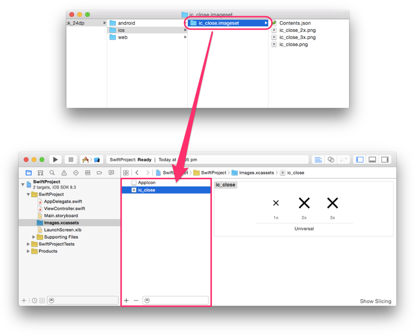
The imageset contains the single, double and triple density images (1x, 2x, 3x) so they work on all known iOS screen densities. Both black and white icons are provided, but we recommend using UIImage's imageWithRenderingMode with UIImageRenderingModeAlwaysTemplate which will allow the image to be used as an alpha mask that can be tinted to any possible color.
Objective-C example:
UIButton *button = [[UIButton alloc] init];
UIImage *closeImage =
    [[UIImage imageNamed:@"ic_close"]
       imageWithRenderingMode:UIImageRenderingModeAlwaysTemplate];
button.tintColor = [UIColor colorWithWhite:0 alpha:0.54f];
[button setImage:closeImage forState:UIControlStateNormal];
Swift Example:
let button = UIButton()
let closeImage = UIImage(named:"ic_close")?.imageWithRenderingMode(
    UIImageRenderingMode.AlwaysTemplate)
button.tintColor = UIColor(white:0, alpha:0.54)
button.setImage(closeImage, forState:UIControlState.Normal)